Wednesday, July 10, 2013

Visual Education Statistics - Equating


                                                             18
The past few posts have shown that if two tests have the same student score standard deviation (SD) they are easy to combine or link. Both tests will have the same student score distribution on the same scale.

Equating is then a process of finding the difference between the average test scores and applying this value to one of the two sets of test scores. Add the difference in average test score to the lower set of scores, or subtract it from the higher set to combine the two sets of test scores.

This can be done whenever the SDs are within acceptable limits (considering, all factors that may affect the test results, the expected results, and the intended use of the results). This is IMHO a very subjective judgment call to be made by the most experienced person available.

There are two other situations: same average test score but the different SDs are beyond acceptable limits, and both test score and SD differences are beyond acceptable limits for the two tests. In both cases we need to equate the two different SDs, the two different distributions of student scores.

Chart 48 is a re-tabling of Chart 44. The x-axis in Chart 48 shows the set Standard Deviation (SD) used in the VESE tables in prior posts. Equating a low SD test (10) to a high SD test (30) has different effects then equating a high SD test (30) to a low SD test (10). The first improves the test performance; the second reduces the test performance.

There is then a bias to raise the low SD test to the high SD test. “The test this year was more difficult than the test last year,” was the NCLB explanation from Texas, Arkansas, and New York. [It was not that the students this year were less prepared.]

The most frequent way I have seen mapping (Livingston, 2004, figure 2, page 14) done is to plot the scores of the test to be equated on the x-axis and the scores of the reference test on the y-axis. The equate line for two tests with similar average test scores and SDs is a straight line from zero through the 50% point on both axes (Chart 49).

If the average test scores are similar but the SDs are different, the equate line becomes tilted to expand (Chart 50) or contract (Chart 51) the equated values to match the reference test. Mapping from a low SD test to a higher SD tests leaves gaps. Mapping from a high SD test to a low SD tests produces clumping, in part, from rounding errors.

Mapping a new difficult test to an easier reference test with the same SD increases the values on the equating line, as well, as truncates it. Any new test scores over 30 on Chart 52 have no place to be plotted of the reference test scale. 

The equating with an increase in both SD and average test score expands the distribution and truncates the equating line even more (Chart 52). A comparison of the two above situations as parallel lines (Chart 53) helps to clarify the differences.
Both increase the new difficult test average test score value of 20 counts to 30 counts on the reference scale. In this simple example based on a normal distribution, the remaining values increase in a uniform manner of equal units of 10 with the same SD and 15 when mapping to the larger SD.

The significance of this is that in the real world, test scores are not distributed in nice ideal normal distributions. The equating line can assume many shapes and slopes.

The unit of measure needed to plot an equating chart must include equivalent portions of the two distributions. Percentage is a convenient unit: equipercentile equating. [More on this in the next post.]

Whither Test A is the reference test, or Test B is the reference test, or both are combined as one analysis is the difficult subjective call of the psychometrician. So much depends on the luck on test day related to the test blueprint, the item writers, the reviewers, the field test results, the test maker, the test takers and many minor effects on each of these categories. 

This is little different from predicting the weather or the stock market, IMHO. [The highest final test scores at the Annapolis Naval Academy were during a storm with very high negative air ion concentrations.] The above factors also need to include the long list of excuses built into institutionalized education at all levels.

On a four-option item, chance alone injects an average 25% value (that can easily range from 15 to 35%) when students are forced to mark every item on a traditional multiple-choice (TMC) test. Quality is suppressed into quantity by only counting right marks: Quality and quantity are therefore linked into the same value. TMC high test scores have higher quality then lower test scores, but this is generally ignored.

It does not have to be that way. Both the partial credit Rasch model IRT and Knowledge and Judgment Scoring permit students to report what they trust they know and can do and what they have yet to learn accurately, honestly and fairly. No guessing is required. Both paper tests and CAT tests can accept, “I trust I know or can do this,” “I have yet to learn this,” and if good judgment does not prevail, “Sorry, I goofed.”  Just score 2, 1, and 0 rather than 1 for each right mark (for whatever reason or accident).

A test should encourage learning. The TMC at the lower scores is punitive. By scoring for both quantity and quality (knowledge and judgment) students receive separate scores, just as is done on most other assessments. “You did very well on what you reported (90% right) but you need to do more to keep up with the class” rather than “You failed again with a TMC score of 50%.

Classroom practice during the NCLB era tragically followed the style of the TMC standardized tests conducted at the lowest levels of thinking. The CCSS tests need to model rewarding students for their judgment as well as right marks. [We can expect the schools to again doggedly try to imitate.] It is student judgment that forms the basis for further learning at higher levels of thinking: one of the main goals of the CCSS movement. The CCSS movement needs to update its use of multiple-choice to be consistent with its goals.

Equating TMC meaninglessness does not improve the results. This crippled form of multiple-choice does not permit students to tell us what they really know and can do that is of value for further learning and instruction.

- - - - - - - - - - - - - - - - - - - - - 

Free software to help you and your students experience and understand how to break out of traditional-multiple choice (TMC) and into Knowledge and Judgment Scoring (KJS) (tricycle to bicycle):


Wednesday, July 3, 2013

Visual Education Statistics - Standardized Tests


                                                              17
Standardized test makers use statistics to predict what may happen; classroom statistics describe what has happened. Classroom tests include two or three dozen students. Standardized test making requires several hundred students. Classroom tests are given to find out what a student has yet to learn and what has been learned. Standardize tests are generally given to rank students based on a benchmark test sample. Classroom and standardized tests have other significant differences even though they may use many of the same items.

I took the two classroom charts (37 and 38 in a previous post) and extended the standard deviations (SD) from 5 - 10%, to 10 - 30%; a more realistic range for standardized tests (Chart 44). At a 70% average score and 20% SD the normal curve plots of 40 students by 40 items started going off scale. I then reversed the path back to the original average score of 50% as the SD rose from 20% to 30%.

The test reliability (KR20) continued to rise with the SD for these normal distributions set for maximum performance. The item discrimination (PBR) rose slightly. The relative SEM/SD value decreased (improved) from 0.350 to 0.157 as test reliability increased (improved).

The two tests with average test scores of 50% yielded very different test reliability and item discrimination values for SD values of 10% and 30% on Chart 44; the greater the distribution spread, the higher the KR20 and PBR values. [I plotted the N – 1 SD to show how close the visual education statistics engine (VESE) tables were to their expected normal curves.]

The SD is then a key indicator of test performance; the spread of the student score distribution, the main goal for standardized test makers. It is also very sensitive to extreme values. The 30% SD plot was made by teasing the VESE table that I set for 30% SD. The original SD value was near that for a perfect Guttman table (each student score and each item difficulty appear only once), about 28%. By moving four pair of marks, near the extreme ends of the distribution, one count more toward the end, the SD rose to 30%. That is moving four pair of marks out of 400 pair one count each to change the SD by 2%.

The standard error of measurement (SEM) under optimum normal test conditions remained about 4.4% (Chart 44). So, 4.4 x 3 = 13.2%. A difference in a student’s performance of more than 13.2% would be needed to accept the scores as representing a significant improvement with a test reliability of 0.95. All of the above mark patterns were not mixed; which is an unrealistically optimum performance.

I looked again at the effect of mixing right and wrong marks on an item mark pattern with a higher SD value than found in the classroom (Chart 45). The change from a SD of 10% to 20% was much smaller than I had anticipated. The effect of deeper mixing was again linear.

Average item difficulty sets limits on the maximum PBR that can be developed (Chart 46). In a perfect world where all items are marked either all right or all wrong, the maximum PBR is 1.0 for individual items.

Looking back at prior posts, I found lower values on a perfect Guttman table (0.84) and a normal curve table set at 30% SD (0.85). The PBR declined along with the SD set to 20% and 10% (Chart 46). 
These values hold for tests with average test scores that range from 50% to 70%.

There is now enough information to construct the playing field upon which psychometricians play (Chart 47).  I chose two scoring configurations: Perfect World and Normal Curve with a SD of 20%. The area in which standardized tests exit is a small part of the total area that describes classroom tests. The average student score and item difficulty were set at 50%.

An item mark pattern at 50% difficulty can produce a PBR of 1.0 in a perfect world (blue). All right marks are together and all wrong marks are together. The PBR drops to zero with complete mixing (Table 20). It falls to a -1.0 when all right marks are together at the lower end of the mark pattern.

The area for the normal curve distribution (red) with a SD of 20% fits inside the perfect world boundary. This entire area is available to describe classroom test items. Items that are easier or more difficult than 50% reduce the maximum possible PBR. They have shorter mark patterns. And here too, fully mixed patterns drop the PBR to zero.

We can now see the problem psychometricians face in making standardized tests. The standardized test area is about 1/8th of the classroom area. Standardized tests never use negative items (that almost excludes misconceptions which cannot be distinguished from difficult items using traditional multiple-choice scoring; as they can using Knowledge and Judgment Scoring).

Chart 44 indicates an average PBR of over 0.5 is need for the desired test reliability of over 0.95 under optimum conditions (no mark pattern mixing). With just ¼ mixing, the window for usable items becomes very small. The effect of mixing right and wrong marks on an item mark pattern varies with item difficulty. A test averaging 75% right with unmixed items would be the same as a test averaging 50% right with partially mixed items.

A 2008 paper from Pearson, by Tony D. Thompson, confirms this situation. “This variation, we argue, likely renders non-informational any vertical scale developed from conventional (non-adaptive) tests due to lack of score precision” (page 4). “Non-informational” means not useful, not valid, does not look right, and does not work, IMHO. “Conventional” means, in general, paper tests and the fixed form tests being developed by PARCC for online delivery for the Common Core State Standards (CCSS) movement.

This comment may be valid for “many educational tests” (page 14). “Also, if an individual’s observed growth is much larger than the associated CSEM, then we may be confident that the individual did experience growth in learning.” This indicates that using simulations within the playing field, as Thompson did, confirms my exploration of the limits of the playing field. [And the CSEM, which is applied to each score, is more precise than the SEM based on the average test score.]

“While a poorly constructed vertical scale clearly cannot be expected to yield useful scores, a well-defined vertical scale in and of itself does not guarantee that reported individual scores will be precise enough to be support meaningful decision-making” (page 28). This cautionary note was written in 2008, several years into the NCLB era.

The VESE tables indicate that the “best we can do” is not good enough to satisfy marketing department hype (claims). Testing companies are delivering what politicians are willing to pay for: a ranking of students, teachers, and administrators only based on a test producing scores of questionable precision. Additional use of these test scores is problematic.

An unbelievable situation is currently being challenged in court in Florida. Student test scores were used to “evaluate” a teacher who never had the students in class! It reveals the mind set of people using standardized test scores.  They clearly do not understand what is being measured and how it is being measured. [I hope I do by the end of this series.] Just because something has been captured in a number does not mean that the number controls that something.

Scoring all the data that can be in the answer sheets would provide the information (which is repeatedly sought but ignored in traditional multiple-choice) needed to guide student, teacher and administrator development. Schools designed for failure (“Who can guess the answer?”), fail. Schools designed for success have rapid, effective, feedback with student development (judgment) held as important as knowledge and skills. Judgment comes from understanding, a goal of the CCSS movement.

 - - - - - - - - - - - - - - - - - - - - - 

Free software to help you and your students experience and understand how to break out of traditional-multiple choice (TMC) and into Knowledge and Judgment Scoring (KJS) (tricycle to bicycle):


Wednesday, June 26, 2013

Visual Education Statistics - Item Mark Patterns


                                                             16
The last post stated, “Lower individual PBR values result from mixing right and wrong marks in an item pattern. Wider score distributions make possible longer item mark patterns.” I was curious about just how does this happen?

I marked Item 30 in Table 19 with five locations. The top location contained four right marks (1s). This location was then changed to wrong marks (0s) and the four right marks were moved one count below. A visual education statistics engine (VESE) table was developed. This process was then repeated in each of the three lower locations.

The above process took an item with an unmixed mark pattern (14 right and 26 wrong) and mixed wrong marks into four lower locations, each with a one right count lower score. I moved four marks as it took this many to get a measurable result with all six statistics with the standard deviation (SD) set at 4 or 10% on a test with 40 students and 40 items (Chart 40).

I did the same thing with the SD set at 2 or 5% (Chart 41) where the effect on lowering the item PBR is greater. But a SD of 5% is not a realistic value. The effect of mixing right and wrong marks would be even less with the SD set at 8 or 20% with 40 students and 40 items. My assumption, at this point, is that the mixing of right and wrong marks will be of little concern in large tests such as standardized traditional multiple-choice (TMC) tests.

Chart 42 shows an interesting observation. Mixing just one count makes no change in the individual PBR for item 30. The reason for this can be seen in Table 19. When a right mark with a related student raw score of 30 is mixing with the next lower location of 29, the math is 30 -1 = 29 and 29 + 1 = 30. The student scores do not change. The students getting the scores do change.
The deeper the mixing, the further the right marks are moved down the student score scale, the lower the individual PBR. But the individual PBR increases the further an unmixed mark pattern descends or lengthens, up to a point.

Items 26 to 31 in Table 19 show how this happens. An S-shaped or sigmoid curve is etched into Table 19 with bold 1’s. Each item is less difficult as you go from item 31 to 26 (0.25 to 0.75). Each mark pattern lengthens linearly.

[The number of mark patterns was 10 at 5% student score SD and 20 at 10% student score SD.]

The PBR and individual variance increase to a point and then decrease (Chart 43). That point is the 70% average student score set for the test. The test score sets the limit for individual item PBRs. In this table, based on optimum conditions, that is 0.73 PBR which provides plenty of room for classroom tests that generally run from 0.10 to 0.50.

Item 29 shows a difficulty of 0.45 and variance of 0.25. Item 28 shows a difficulty of 0.55 and a variance also of 0.25. They fall equidistant from the item difficulty mean of 20 or 0.50. The junction of mean student score and mean item difficulty set the PBR limit.

This has practical implications. The further away the average student score is from 50%, the lower the limit on item discrimination (PBR).

In Table 19 an unmixed marking pattern can only be 12 counts long before it decreases. If the test score had been 50%, the marking pattern could have been 20 counts long and the PBR 100% (as shown in previous posts).

This all comes back to the need for discriminating items to produce efficient tests; tests using the fewest items to rank students using TMC. The problem is, we do not create discriminating items. We can create items, but it is student performance that develops their PBR. This provides useful descriptive information from classroom tests. The development of PBR values is often distorted with standardized tests under conditions that range from pure gambling to being severely stressful.

It does not have to be that way. By offering Knowledge and Judgment Scoring (KJS), or its equivalent, students can report what they actually know and can do; what they trust as the foundation for further learning and instruction. The test then reveals student quantity and quality, misconceptions, the classroom level of thinking, and teacher effectiveness; not just a ranking.

Most students can function with high quality even though the quantity can vary greatly. The quality goal of the CCSS movement can be assessed using current efficient technology once students are permitted to make an individualized, honest and fair report of their knowledge and skills using multiple-choice; just like they do on most other forms of assessment.

- - - - - - - - - - - - - - - - - - - - - 

Free software to help you and your students experience and understand how to break out of traditional-multiple choice (TMC) and into Knowledge and Judgment Scoring (KJS) (tricycle to bicycle):


Wednesday, June 19, 2013

Visual Education Statistics - Student Development


                                                             15
The visual education statistics engine (VESE) is now capable of producing a statistical signature for a course using traditional multiple-choice (TMC) and Knowledge and Judgment Scoring (KJS). 

I selected two scenarios that explore three consecutive tests in each one. All items are set for maximum discrimination (right and wrong marks are not mixed). All student score distributions are normal. Both courses start with an average score of 50% and end with an average score of 70%. A standard deviation of 10% is considered normal and convenient for setting grades.

The first scenario is a class that starts with students of relatively equal abilities (Chart 36). As the course progresses the score distribution widens. This is the natural consequence of the better students doing better and the poorer students lagging behind; a typical result when using TMC that primarily only ranks students. [A good example of how evolution actually works: the self-empowered survive.]

The second scenario is a class that starts with students spread out widely (Chart 37). As the course progresses the score distribution narrows. This is the natural consequence of good student development; one of the results from switching from TMC to KJS where students are empowered to report what they actually know and trust as the basis for further instruction and learning.

The statistical signatures I found are  Charts 38 and 39. In a traditional class the test reliability (KR20), the average item discrimination (PBR), the standard deviation (SD) and the standard error of measurement (SEM) all increased in value. The controlling factor was the spread of student scores.

The SD captures the spread of student scores. In these two scenarios the SD was set to increase or decrease with the average student score, as required by the score distributions in Charts 36 and 37. [The two signatures are not perfect continuations due to rounding errors and my inability to fit the 40 x 40 = 1600 marks under smooth normal curves.]

Individual item discrimination (PBR) is not the controlling factor as it has been set to the maximum for each item. [A visualization of individual  item PBR and  average item PBR is needed here. Lower individual PBR values result from mixing right and wrong marks in an item mark pattern. Wider score distributions (larger SDs) make possible longer item mark patterns. An item mark pattern is visualized in the next post.]

These statistical results are interesting. A traditional class ends with a test with increasing test reliability and a decreasing ability to separate student performance with the SEM. A class that ends with most students empowered (to question, to find answers, and to verify) shows low lower test reliability and an increasing ability to separate student performance with the SEM. This makes sense.

These two scenarios also shed light on teacher effectiveness. Both classes reached the traditional goal of mastery for schools designed for failure. The first, I would imagine, under the direction of traditional instruction aimed at the center of the class. The second would require either special attention to lower performing students or empowering most students to become self-correcting, high-achieving learners; the goal of the Common Core State Standards (CCSS) movement.

 - - - - - - - - - - - - - - - - - - - - - 

Free software to help you and your students experience and understand how to break out of traditional-multiple choice (TMC) and into Knowledge and Judgment Scoring (KJS) (tricycle to bicycle):


Wednesday, June 12, 2013

Visual Education Statistics - Item Number Limits


                                                              14
Adding more items with the same difficulties to a perfect world test on the VES Engine (Table 18) did not change the average student score (50%), the standard deviation (SD of 15.39%), the standard error (SE of 3.44%) or the average item discrimination (PBR of 0.30). The test reliability (KR20) improved but the standard error of measurement (SEM) made a marked improvement (Chart 35).

This makes sense. The more items on a test the greater the test reliability; the greater the test reliability, the smaller the range into which repeated student testing scores can be expected to fall. By doubling the number of items, twice, 20 to 80 items, the SEM fell from 5.39% to 2.64%. By doubling twice again to 320 items, the value again was reduced by half to 1.32%.

The common core state standards (CCSS) movement is now bringing into practice testing with an average difficulty of 50%. This optimizes test performance, but bullies students.

A class of 20 students, IMHO, can produce usable results if eight 40-item tests are used during the course. With a SEM of 1.32%, scores from the same student would only need to be 1.32% x 3 = 3.94% apart to show acceptable improvement in performance.

Testing companies can then market a single test, with a total number of items from 80 to 160, which will rank students and teachers with acceptable precision based on test scores. Each student will have to read every item on paper. Computer adaptive testing (CAT) will generally require less than that number, which means, CAT students will not take the same test.

Again testing is optimized for the testing companies who are only being required to rank students. They can calibrate items on a group of representative students. They can then present different items, but comparable only in difficulty, as equivalent items. This only makes sense if every student has the same general background and preparation and is an average student with average luck on test day. The practice reduces individuality and eliminates creativity. It does not have to be that way.

Armed with the above ability to rank students, testing companies are also marketing more tests: formative, summative, and in between “submative” (neither formative nor summative). The same items can be used on all three. The difference is that the formative process takes place in such a timely manner that the student learns (in seconds to minutes at higher levels of thinking and in minutes to days at lower levels of thinking). The summative test measures what has happened, not what is being learned at the moment.

The “submative” test falls in between as a subtest, but again measures the past. IMHO it also hints that buying such a test is better, in the short term, for school administrators, than letting a good teacher assess in a normal classroom. Relying on short term, lower level of thinking, tests that only rank students does not promote the development students need to become successful self-educable high quality achievers. (CCSS movement multiple-choice test questions may be highly contrived requiring considerable problem solving skills, but are still scored easier than a bingo operation: good luck on finding the right answer, with 1/4 free instead of 1/25 free.)

It does not have to be that way. The very same items can be scored to promote student development; function as formative experiences, and provide immediate guidance for teaching. Just because testing companies can deliver high quality rankings does not mean we should limit the return on the time and money invested (by students, teachers, and tax payers) to just ranking. This cripples schooling. The decade of NCLB experiences present the evidence here.

As suggested in the previous post, we need more than 20 test items and IMHO a test scored for what students trust they actually know and can do such as Power UP Plus by Nine-Patch Multiple-Choice,  partial-credit Rasch model by Winsteps and Amplifire by Knowledge Factor.

- - - - - - - - - - - - - - - - - - - - - 

Free software to help you and your students experience and understand how to break out of traditional-multiple choice (TMC) and into Knowledge and Judgment Scoring (KJS) (tricycle to bicycle):


[I again checked the test reliability values with the Spearman-Brown prophecy formula (Table 19). At this high end of the range, they closely matched the results from the VES Engine. The test with 20 items made four predictions that were increasingly close to the observed (x1) test reliability.]


Wednesday, June 5, 2013

Visual Education Statistics - Student Number Limits


                                                             13
Adding more tests from students with the same abilities to the VES Engine (Table 18) did not change the average student score, standard deviation (SD), test reliability (KR20 or Pearson r), standard error of measurement (SEM) or average item discrimination (PBR). It does change the stability of the data. A rule of thumb is that data become reasonably stable when the count reaches 300.

Above 300 the count becomes representative of what can be expected if all possible students were tested. But no student or class wants to be representative. All want to be above average. All want their best luck on test day when using traditional multiple-choice (TMC).

Although individual students do not benefit from testing increasing numbers; teachers, schools, and test makers do. The SD divided by the square root of the number of tests yields the standard error of the test score mean (SE).

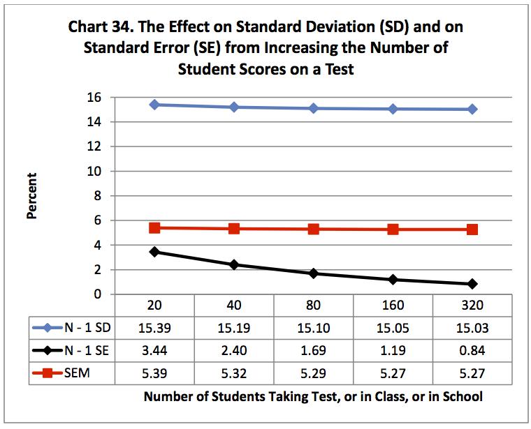
Chart 34 shows a slight curve for SD and SEM. This comes from dividing by N – 1 rather than N. The effect disappears above a count over 100. The SE is smaller than the SD and SEM and shows a marked change for the better as more tests are counted. It easily permits finding differences between groups of students when you use test enough students.

The SD, SEM and the SE have the same predictive distributions. About 2/3 of student scores are expected to fall within plus/minus one SD (15.39% for a test of 20 students) of the mean. If a student could repeat the test, with no learning from previous tests, 2/3 of the repeats would be expected to fall within plus/minus one SEM (5.39% for a test of 20 students) of the mean. These values (expected 2/3 of the time) cover too wide a range (30.78% and 10.78%) to permit separating individual student performance from year to year.

The SE is different. Starting with 20 students; SEM and SE are fairly close. But with 320 students the SE (0.84%) is five times more sensitive than the SEM (5.27%) in its ability to detect differences between groups than the SEM in its ability to detect differences in student ability.

These values are all from perfect world data (Table 18) where all students earn the same low score or high score. Item discrimination is set at the maximum. The test is performing at its best (average student score and item difficulty of 50%, test reliability at 0.877, and average item discrimination at 0.30). With only 20 items, these data indicate to me that individual student performance cannot be divided into different groupings by a perfect world SEM and therefore cannot be divided with actual classroom data either.

These data also put into question if the SE can separate group performance for individual classes, individual teachers and individual schools. The counts are just too small. Teachers with large classes, or with several sections, have an advantage over those with a small class.

Adding more students to a test is of little benefit to individual students. It is of benefit to teachers , schools, and test makers. For students we need more test items and IMHO a test scored for what students trust they actually know and can do such as Power UP Plus by Nine-Patch Multiple-Choice,  partial-credit Rasch model by Winsteps and Amplifire by Knowledge Factor.

- - - - - - - - - - - - - - - - - - - - - 

Free software to help you and your students experience and understand how to break out of traditional-multiple choice (TMC) and into Knowledge and Judgment Scoring (KJS) (tricycle to bicycle):


Wednesday, May 29, 2013

Visual Education Statistics - Lower Limits


                                                              12
I discussed the relationships between statistics in Post 11 based on changing individual answer marks. This post will start the exploration of the limits on these statistics based on student scores and item difficulties. How much change is produced by a specific strategy?

These statistics can all be used to describe what has happened in meaningful useful ways.  Here I begin to look at their ability to predict what may happen. This concern has practical value in being able to safely package descriptive and predictive statistics for maximum marketing effect. Or reworded, are testing companies really delivering what they claim?

Chart 32 relates observations from seven exploratory strategies:
  1. A perfect Guttman scaled table in a 21 by 21 cell field.
  2. A 21 by 20 Guttman table missing the item with a difficulty of zero.
  3. A 20 by 20 Guttman table also missing the student score of zero.
  4. A 20 by 20 normal curve distribution based on the SD of the above table.
  5. A 20 by 20 distribution based on a typical classroom, SD = 10.
  6. A 20 by 20 bimodal distribution at 35% and 65% student scores.
  7. A 20 by 20 perfect world distribution for the above table.

The three Guttman scaled tables produced similar results. Removing one or both zero values had little effect. The SD remained around 30% (Chart 32).

The normal curve table was also similar to the 20 by 20 Guttman scaled table but with a reduced SD (25.26%).  I was impressed that a normal curve distribution based on the 20 by 20 table SD had so little effect on the SEM and KR20. It did indicate that a shortened score range lowers the SD.

I then configured a table for a typical classroom SD. The SD = 10 table produced the smallest SEM (4.87%). SD = 9.25%. Clearly, to have a small SEM, you must have a small SD. But you also run the risk of low test reliability (0.72).

I next configured the table for a typical classroom distribution generally seen when using Knowledge and Judgment Scoring (KJS). Routine use of KJS produces and sorts out those students, who have learned to be comfortable using all levels of thinking, from the remaining passive pupils in the class who continue to select traditional multiple-choice (TMC). The bimodal table produced an SEM of 5.98%. SD = 16.38%.

I then compared a bimodal table and a perfect world table (see Post 7 in this series). In a perfect world all students receive the same low score or the same high score. These modes were set at the same 35% and 65% modes on both tables. The perfect world table (Table 18) produced similar results, SEM (5.39%). SD=15.39%.

(Free download of Table 18: http://www.nine-patch.com/download/VESEG3501.xlsm or .xls)

I explored the perfect world table further after seeing that the results for the perfect world table and the bimodal table were close at the 35%-65% mode locations. Chart 33 shows the effects of changing the range of the right and wrong modes on a perfect world table. Increasing the range increased the SEM (red) and test reliability (purple). The first effect is bad, the second effect is good. The price for a high test reliability is a reduced ability to tell if two student scores are significantly different.

Post 11 shows linear relationships when changing individual marks, except for item discrimination. This post, working with student scores and item difficulties, shows a linear relationship for item discrimination: AVG PBR of 0.1, 0.2, 0.3, 0.4 and 0.5 (Chart 33). As the two answer modes are moved farther apart, the average PBR and SD increase linearly, but appear curved on the log base 10 scale.

Standardized tests tend to have high SDs. The score distributions tend to be flat, multi-modal. This situation is related to high test reliability and high SEM (Chart 33).

A standardized test must do better than this: under the best possible conditions a SEM of about 5% is related to a test reliability of about 0.90 with the modes set at 35%-65% and a SD of 15%. That would take a difference in score from one year to the next of 3 x 5 = 15% or one and one-half letter grade to support an acceptable improvement (difference) in student performance but with an unattainable test performance.

The above tables were populated with items drawn from a Guttman scaled table with all items set at their maximum item discrimination. The results then represent the best obtainable, the maximum limit for a 20 by 20 table. We need more students and more test items.

- - - - - - - - - - - - - - - - - - - - - 

Free software to help you and your students experience and understand how to break out of traditional-multiple choice (TMC) and into Knowledge and Judgment Scoring (KJS) (tricycle to bicycle):